Thursday 17 February 2011

A real turnaround . . .

Roberto, well done, you've made a real impact on the work you need, and you must keep it up.

This is a checklist to make sure everything is in place for the preliminary site:

Using a camera introduction

Photoshop your picture/s and post to blog.*

Research on four school websites: 400 words short essay.

Survey - the survey must be given to 5 -10 people and the results posted on your blog

Catchup, including survey, annotated websites.

Draft brief for preliminary site.

Page layout.

Photoshop, first artwork*.

Setting up iWeb*.

Working in iWeb*.

Finish your initial site, and continue in your own time*.


*If there's an asterisk, it means you can only do this in school because of the software (unless you have a Mac at home).


Check the list, and fill in the gaps. I think you need to catch up the Photoshop, the sketch and the survey.

Tuesday 15 February 2011

Draft brief for preliminary site

For my main website I am choosing to create a site that is both informative and creative, whilst being aesthetically pleasing. I will create a site that is for health and fitness in the community, through exercise. When creating the website I shall look at other websites that are similar to mine for inspiration in the layout and the information needed for a successful site. I will use videos and images to inform the viewer and to give a visual side to the site. There will be interactive parts to the site, with dropdown toolbars showing off information. I will produce links to other websites such as sports facilities such as gyms, as well as links to healthy eating sites. This website will tell the viewer how you can get healthy and fit through eating the right foods, living the right lifestyle, and doing lots of exercise.

On the first page, a welcome page, there will be a big logo that will represent the site. The logo itself will be a link to the next page that will be a Home page. Underneath the logo will be a company motto. The colour scheme will be very bright and informal. This will create a friendly vibe to the site.

The second page that is a Home page will be the most filled page. This page will have links to each of the pages through buttons on drop downs. There will be links to other websites that relate to health and fitness. The use of video’s and images on this home page will create a more visual side to the site. There will be a 'search' toolbar and a 'contact us' link to aid the viewer. The colour scheme will again be friendly and welcoming with the bight colour scheme used.

After the main site there will be several pages that will each be titled differently. There will be pages such as ‘healthy eating’, ‘healthy living’ and ‘exercise.’ Each one will have images and videos on them to create a more visual, professional and believable look to the site. The colour scheme will again be friendly and welcoming with the bight colour scheme used.

My first draft


Friday 11 February 2011

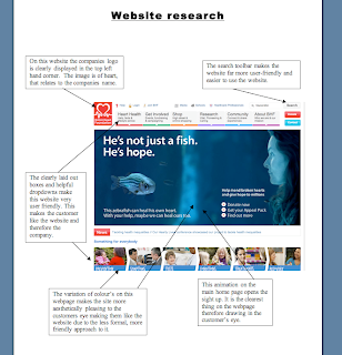
Website Research


Photoshop picture


For this picture I started off by first capturing the image with a camera. I then went onto Adobe Photoshop CS3 and started to edit it. I added on a layer that was an image of an American football pitch and set it as the background. I then scaled the original photo and then added an image of a football on top of the original photo.

Tuesday 8 February 2011

website essay


Through looking at different schools websites I have come to the conclusion that they all have the same, warm, welcoming theme. The colour’s used are gentle and kind, pastel colour’s which are easy on the eye. The clear layout and easy use if the website means that the user can tell that it shows that the designers have spent time thinking about it, which intern brings a better opinion of the school. The colour’s and the fonts used are big and catching, which therefore makes the website welcoming to the viewer. Most of the sites that I visited have images of the pupils in their school day. All of the images are similar, with the pupils creating or learning, all with smiles on heir faces. These images portray the school as a friendly, educational school with unlimited opportunities. There are also normally an interactive section of the website. Either a video or a slide show are the most common features, however, there are also features such as drop downs and a student area. All of the websites that I have viewed each have a Headmaster’s welcome message. This message is a formal message that links in what the school does and why it is good for the parent’s child. This message needs to convince the parents that this school is the best school for their child. There is always a crest of the school badge on each page with normally the school colour’s as the theme, with the schools motto near. On the home page, there are links to other pages. Things like; ‘subjects, extracurricular activities and school events’ are the most common links to the other pages. These allow the viewers to go to ether pages of the website to view more details about the school. Websites that have these, I find are far more useful then those that don’t. The more informative the website is, the higher the opinion the viewer’s opinion of the school is. Several of the websites that I visited also have links to other websites. Sites like ‘Google’, educational sites like ‘Sam Learning’ and university sites such as ‘UCAS’ are the most common links on the schools main pages. On every one of the websites that I visited, each one had a search bar so that it could make that website far easier to use and far more user friendly therefore creating a higher opinion of the school in the viewers minds.